
Since the release of ChatGPT Image 2.0, its image generation capabilities have amazed many users. Especially in typography, complex compositions, and product detail control, it has improved significantly compared to the past, reaching a level that is starting to approach real commercial design use.
But many people discover after testing it: why do others create ad posters that look professional enough for actual commercial use, while theirs still look like ordinary and random AI images?
The problem is usually not the tool, but the input method.
AI does not automatically understand your design needs. It only executes based on your instructions. The more complete the prompt, the more it looks like an ad visual; the more casual the prompt, the more it looks like a random illustration.
If you want ChatGPT Image 2.0 to generate visuals you can actually use for ads, social media graphics, or even website banners, remember this simple formula:
Product Image + Style + Dimensions + Headline + Scene Description
These five elements are the foundation of ad visual creation.
Many people open ChatGPT and type: “Help me create a premium-looking ad visual for my product.”
But that instruction is too vague.
The first thing you should do is upload a high-resolution product image.
.png)
How to upload a product image:
.png)
Then tell AI:
Example:
If you are selling coffee beans, do not just write “Generate a coffee ad visual.”
After uploading the product image, write:
“Based on the product image, generate an ad visual. The product is a black-packaged coffee bean bag placed in the center of a wooden table, front-facing the camera, logo clearly visible, with a few coffee beans scattered beside it. Aspect ratio 2:1.”
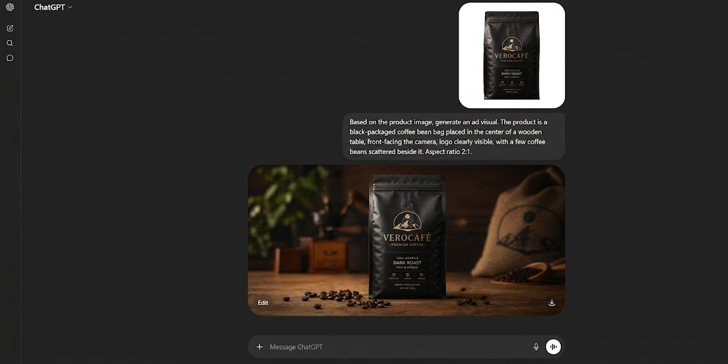
This type of specific prompt will produce much better results than simply saying “Generate a coffee ad.”
Advanced tip:
Add composition requirements: “Product centered, occupying 40% of the frame, leave upper space for headline.”
This makes the visual look more like a real advertising layout.
“Premium feel” means almost nothing. You need specific style references.
Even “premium” can mean many styles, including but not limited to:
Wrong prompt:
“Premium ad visual”
Correct prompt:
“Minimal white background, Apple-style product photography, soft lighting, realistic shadows, commercial advertising style.”
.png)
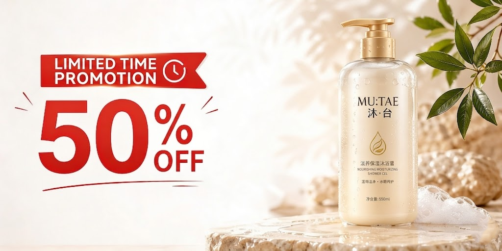
Prompt:
Skincare serum bottle centered, light beige background, luxury advertising style, soft lighting, clean composition, magazine-grade photography.
If you do not know style keywords, reference brands directly:
One major mistake in ad visuals is creating a beautiful image that does not fit the platform.
Wrong size causes text to be cropped, products to appear too small, or compositions to feel empty.
Common ratios:
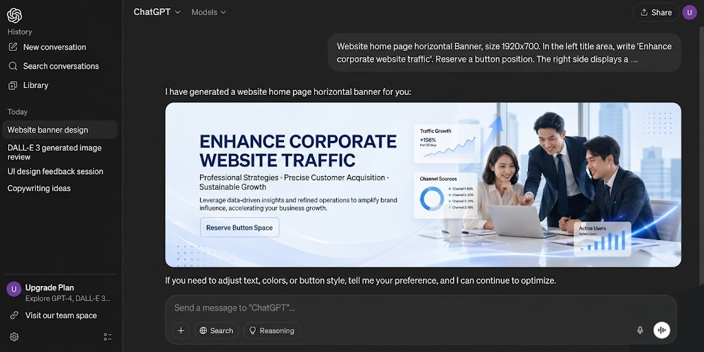
For website banners, tell AI:
“Horizontal wide image suitable for website homepage top banner, leave headline space on the left, place main product image on the right.”
Then it looks like a usable banner, not just a pretty picture.
Instead of adding text afterward, tell AI upfront.
Examples:
“Leave upper space for headline” or “Leave whitespace on the left for ad copy”
To test text generation:
“Headline in bold English, large and readable.”
A product placed alone looks like a catalog shot.
Advertising visuals need emotional context, so add scenes to integrate the product into an environment.
.png)
AI understands photography terms.
Use prompts like these instead of just saying "make it beautiful":
.png)
.png)
Wrong approach: Stuffing 50 instructions into one prompt.
Correct way:
Round 1:
Generate base composition.
“Create skincare ad visual, product centered, beige background, luxury style.”
Round 2:
Modify:
“Keep product unchanged, change background to marble texture, add gold lighting.”
Higher success rate.
Many people simply stretch a poster into a banner.
That is wrong.
A banner needs:
For product websites:
“E-commerce homepage banner, promotional headline on left, product combination on right, white clean design.”
Great for website visual drafts.
Template:
Generate an ad visual, product is (product), subject placed (position), style is (style), dimensions (ratio), headline area at (position), scene is (scene), commercial advertising photography style, high detail.
Example:
.png)
Prompt: Generate ad visual, product is Bluetooth earbuds, subject placed right side, futuristic tech style, 2:1 ratio, reserve headline space on left, scene is deep blue glowing environment, commercial advertising photography.
Good enough for a usable first draft.
Professional design is never done in one draft.
Same for AI visuals.
Usually test:
Then choose the best.
Treat AI as a design assistant, not a lottery machine.
.png)
Prompt:
Generate premium skincare ad visual, one serum bottle placed on the right occupying 40%, light beige background, luxury commercial photography style, soft lighting, 2:1 ratio, reserve headline “Radiant Renewal” at top, leave button area at bottom, magazine advertising composition.
This is not simply “generate an image.”
This is art direction.
ChatGPT Image 2.0 is not popular only because it can create images.
It is powerful because it can approach commercial design tasks: understanding layout, handling typography, controlling style, and supporting revisions. But no matter how powerful the tool is, method matters.
Remember these five steps:
Upload product image → Define style → Set dimensions → Reserve headline → Add scene
Then optimize through iterations. Your result will stop looking like ordinary AI images and start becoming real ad assets. If you want to practice, choose one product and test three variations using the prompt template above. You will quickly see the difference.
Effective marketing is not just generating a beautiful image — it is making visuals, websites, content and search traffic work together.
To learn how to combine AI visuals, web design and AI SEO to improve business exposure and customer acquisition, WhatsApp 012-687 1461 or visit www.newpages.net/ai-seo to learn about NEWPAGES AI SEO services.
If you are planning a business website, view pricing at: www.newpages.net/pricing
 Vietnam